Interpretable Machine Learning with SHAP Values
Explaining how a model arrived at a prediction is an important part of using machine learning. In this post, we will be exploring how to use SHAP values, a widely used model interpretation method, and compare them with other methods. You will learn what SHAP values are and how to apply them using the popular shap Python library.
We will first motivate model explainablity using linear regression before considering tree-based models and common feature importance measures used with trees. We will discuss the shortcomings of these methods then introduce SHAP values as the only feature importance measure that addresses them. We will discuss the theory and computation of SHAP values before exmaples of the various diagnostic plots, finally connecting them to partial dependence plots and individual conditional expectation plots. We conclude with some caveats and warnings for using SHAP values in causal and time series contexts.
1
2
3
4
5
6
7
8
9
10
11
12
13
14
15
16
%matplotlib inline

import pandas as pd
import shap
from sklearn.linear_model import LinearRegression
from sklearn.ensemble import RandomForestRegressor
from sklearn.model_selection import train_test_split
import numpy as np
import matplotlib.pyplot as plt
from ydata_profiling import ProfileReport


CACHE = True
PROFILE = False

np.random.seed(1234)
Improve your data and profiling with ydata-sdk, featuring data quality scoring, redundancy detection, outlier identification, text validation, and synthetic data generation.
We will be using the classic California housing dataset, which comes with the shap package. Below, we will print the description of the data and variables.
1
2
3
4
5
6
7
8
9
10
11
12
13
14
15
X, y = shap.datasets.california()

# combined dataframe
df = pd.DataFrame(X, columns=X.columns)
df['price'] = y

with open("california_housing_descr.txt") as f:
    print(f.read())

X_train, X_test, y_train, y_test = train_test_split(X, y)

# use ydata-profiling to generate a report
if PROFILE:
    profile = ProfileReport(df, title="California Housing Dataset Profile", minimal=False)
    profile.to_file("california_housing_report.html")
1
2
3
4
5
6
7
8
9
10
11
12
13
14
15
16
17
18
19
20
21
22
23
24
25
26
27
28
29
30
31
32
33
34
35
36
37
38
39
40
41
42
43
44
45
46
.. _california_housing_dataset:

California Housing dataset
--------------------------

**Data Set Characteristics:**

:Number of Instances: 20640

:Number of Attributes: 8 numeric, predictive attributes and the target

:Attribute Information:
    - MedInc        median income in block group
    - HouseAge      median house age in block group
    - AveRooms      average number of rooms per household
    - AveBedrms     average number of bedrooms per household
    - Population    block group population
    - AveOccup      average number of household members
    - Latitude      block group latitude
    - Longitude     block group longitude

:Missing Attribute Values: None

This dataset was obtained from the StatLib repository.
https://www.dcc.fc.up.pt/~ltorgo/Regression/cal_housing.html

The target variable is the median house value for California districts,
expressed in hundreds of thousands of dollars ($100,000).

This dataset was derived from the 1990 U.S. census, using one row per census
block group. A block group is the smallest geographical unit for which the U.S.
Census Bureau publishes sample data (a block group typically has a population
of 600 to 3,000 people).

A household is a group of people residing within a home. Since the average
number of rooms and bedrooms in this dataset are provided per household, these
columns may take surprisingly large values for block groups with few households
and many empty houses, such as vacation resorts.

It can be downloaded/loaded using the
:func:`sklearn.datasets.fetch_california_housing` function.

.. rubric:: References

- Pace, R. Kelley and Ronald Barry, Sparse Spatial Autoregressions,
  Statistics and Probability Letters, 33 (1997) 291-297
A Motivating Example: Linear Regression
Linear regression models are simple enough to be considered “intrinsically interpretable”. The prediction from a linear model is simply the sum of the products of model coefficients and the variable values.
\[y = \beta_0 + \beta_1 x_1 + \dots + \beta_k x_k\]It might be tempting to use the magnitudes of the coefficients to determine the most important variables, but this would provide a misleading understanding of the model if the units of measure of the variables are different.
In the California housing dataset, median income is measured in tens of thousands of dollars and the coefficient is 0.54, which is a similar magnitude to the rest of the coefficients. However, if we measure median income in dollars, then coefficient would 5 orders of magnitude greater than the rest of the coefficients and would be deemed the “most important” by magnitude.
1
2
3
4
5
6
7
8
9
10
11
12
13
14
15
16
17
# Train a linear regression model using the specified features
linear_model_features = ['MedInc', 'HouseAge', 'AveRooms', 'AveOccup', 'Population', 'AveBedrms']
X_train_selected = X_train[linear_model_features]
X_test_selected = X_test[linear_model_features]

# Initialize and train the linear regression model
linear_model = LinearRegression()
linear_model.fit(X_train_selected, y_train)

# Print the model coefficients
coefficients = pd.DataFrame({
    'Feature': linear_model_features,
    'Coefficient': linear_model.coef_
})
print("Linear Regression Coefficients:")
print(coefficients)
print(f"\nIntercept: {linear_model.intercept_:.4f}")
1
2
3
4
5
6
7
8
9
10
Linear Regression Coefficients:
      Feature  Coefficient
0      MedInc     0.540557
1    HouseAge     0.016600
2    AveRooms    -0.223501
3    AveOccup    -0.004539
4  Population     0.000022
5   AveBedrms     1.037077

Intercept: -0.4440
There is a way to view the importance of each variable for an individual prediction. Since the predicted value of a linear model is a linear sum of coefficients multipled by the value of the variable (the $\beta_i x_i$ terms in the sum), we can decompose the predictions into these products and view their magnitudes since they are all in the same unit of measure as the target variable (the price of homes in our example).
1
2
3
# Calculate predictions manually by multiplying features by coefficients and adding the intercept
manual_predictions = np.dot(X_test_selected, linear_model.coef_) + linear_model.intercept_
np.allclose(manual_predictions, linear_model.predict(X_test_selected))
1
True
1
2
3
4
5
6
7
8
9
10
11
# create a matrix of the products
linear_components = pd.DataFrame(np.concatenate(
    [
        np.repeat(linear_model.intercept_, X_test_selected.shape[0]).reshape((-1, 1)),
        np.multiply(X_test_selected.values, linear_model.coef_)
    ],
axis = 1),
    columns = ['Intercept'] + linear_model_features
)
# verify the sum of the linear components equals the prediction
np.allclose(linear_components.sum(axis=1), (manual_predictions))
1
True
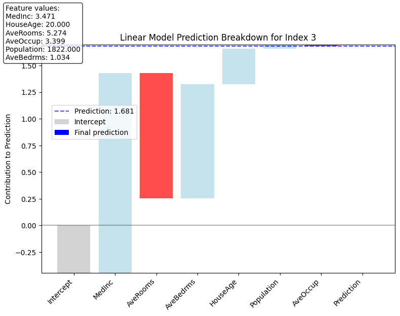
We can use these products as feature importances to create some simple visualizations such as a waterfall plot that shows how to get from the intercept of the model to the predicted value.
1
2
from utils import plot_linear_prediction_waterfall
plot_linear_prediction_waterfall(3, linear_components=linear_components,model=linear_model, X_test_selected=X_test_selected)
1
2
3
4
5
6
7
8
9
Prediction: 1.681

Feature contributions (sorted by magnitude):
MedInc: 1.876
AveRooms: -1.179
AveBedrms: 1.072
HouseAge: 0.332
Population: 0.039
AveOccup: -0.015
Model Explainability for Tree-Based Models
We just saw how the structure of a linear model can yield a nice, clean interpretation.
In modern applications, the best results are often obtained using large datasets and complex, non-linear models whose output is difficult to interpret and whose inner mechanics are non-transparent and difficult to understand. In many settings, tree-based methods such as random forests and gradient boosting machines achieve the best performance, especially on tabular data that is often found in the business world.
Lundberg and Lee [1] identify three desirable properties that a good feature importance measure should have
-
Consistency: If the model changes in such a way as to increase the marginal importance of a feature, the feature importance for that feature should not decrease.
-
Prediction-level explainations: the feature importance measure can explain individual predictions, not just the global importance for the entire model.
-
Local Accuracy (Additivity): the sum of the feature importance measures for an individual prediction sum to the predicted value, i.e. $f(x) = \sum_{i} \phi_i$ where the $\phi_i$ are the feature importance measures for the $i$ th feature. (Note that this requires prediction-level explainations)
There are numerous feature importance measures for use with both trees. The ones that are the most often used are:
- Permutation Importance
- Gain
We will give an example of each and explain why none of these satisfy all three properties and then introduce SHAP as the only feature importance measure that satisfied all three.
1
2
3
4
5
6
7
8
9
10
11
12
13
14
15
16
17
18
19
20
21
22
23
24
25
26
27
28
29
30
31
32
33
34
35
36
37
38

from sklearn.metrics import mean_squared_error
import json


if CACHE:

    # Load pre-computed best parameters from JSON file
    try:
        with open('rf_best_params.json', 'r') as f:
            best_params = json.load(f)
            print("Loaded best parameters from file:", best_params)

        # Create RandomForest model with best parameters
        best_rf = RandomForestRegressor(**best_params, random_state=42)

        # Train the model
        best_rf.fit(X_train, y_train)

        # Evaluate on test set
        test_score = best_rf.score(X_test, y_test)
        print(f"R² Score on Test Set: {test_score:.4f}")

        # Calculate predictions and MSE on test set
        y_pred = best_rf.predict(X_test)
        mse = mean_squared_error(y_test, y_pred)
        print(f"MSE on Test Set: {mse:.4f}")
    except FileNotFoundError:
        print("Cache file not found, will train model from scratch")

else:

    from utils import train_rf_model

    best_rf, best_params = train_rf_model(X_train, y_train, X_test, y_test)
    with open('rf_best_params.json', 'w') as f:
        json.dump(best_params, f, indent=4)
1
2
3
4
5
6
7
Loaded best parameters from file: {'n_estimators': 200, 'min_samples_split': 2, 'min_samples_leaf': 1, 'max_features': 'log2', 'max_depth': 30, 'bootstrap': False}


R² Score on Test Set: 0.8142


MSE on Test Set: 0.2488
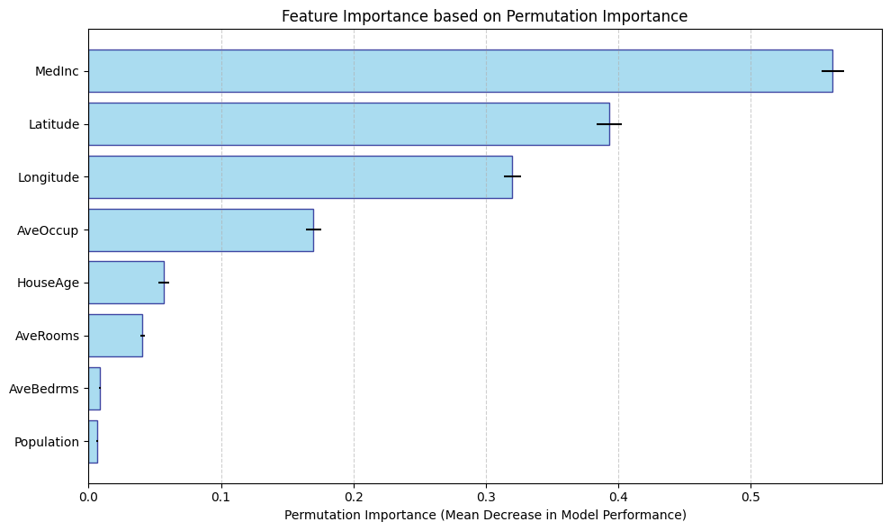
Permutation Importance
Permutation importance works by randomly shuffing a feature then watching how accuracy of the model degrades. By breaking the dependence between the feature and the target variable, the idea is that we can see how much the model truely relies on that feature.
Since permutation importances is measured with respect to model performance, computing it using the training set can provide misleading results on overfitted models, so it is best practice to calculate it using data not used to train the model.
Since the permutations are random, it is important to compute permutation importance across multiple permutations and average them. You can also look at their variance as well.
1
2
3
4
5
6
7
8
9
10
11
12
13
14
15
16
17
18
19
20
21
22
23
24
25
26
27
28
29
30
31
32
33
34
35
36
from sklearn.inspection import permutation_importance

# Calculate permutation importance for RandomForest model

# Calculate permutation importance
# set n_repeats to compute the mean standard deviation of the importances
perm_importance = permutation_importance(best_rf, X_test, y_test, n_repeats=10, random_state=42)

# Sort the permutation importance by value
sorted_indices = perm_importance.importances_mean.argsort()
sorted_importances = perm_importance.importances_mean[sorted_indices]
sorted_features = X.columns[sorted_indices]
sorted_std = perm_importance.importances_std[sorted_indices]

# Create horizontal bar plot
plt.figure(figsize=(10, 6))
plt.barh(range(len(sorted_features)), sorted_importances, xerr=sorted_std,
         color='skyblue', edgecolor='navy', alpha=0.7)

# Add feature names as y-tick labels
plt.yticks(range(len(sorted_features)), sorted_features)

# Add labels and title
plt.xlabel('Permutation Importance (Mean Decrease in Model Performance)')
plt.title('Feature Importance based on Permutation Importance')

# Add grid for better readability
plt.grid(axis='x', linestyle='--', alpha=0.6)

# Adjust layout and display
plt.tight_layout()
plt.show()

# Print the actual values for reference
for feature, importance, std in zip(sorted_features, sorted_importances, sorted_std):
    print(f"{feature}: {importance:.4f} ± {std:.4f}")
1
2
3
4
5
6
7
8
Population: 0.0063 ± 0.0008
AveBedrms: 0.0085 ± 0.0007
AveRooms: 0.0407 ± 0.0015
HouseAge: 0.0565 ± 0.0041
AveOccup: 0.1698 ± 0.0057
Longitude: 0.3199 ± 0.0063
Latitude: 0.3928 ± 0.0094
MedInc: 0.5618 ± 0.0085
Advantages
-
Easy to understand and implement; provides a quick, global overview of feature importance.
-
Can be used with any model.
-
Satisfies the consistency property.
Disadvantages
-
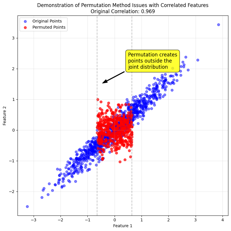
Permuting the values of a single features can produce data points outside the distribution of the data when features are correlated.
-
Does not provide prediction-level feature importances and so cannot be locally accurate.
-
Permutation importance can split the importance between correlated features, making one (or both) features seem less important than they actually are.
-
Permutation importance uses the model performance instead of output, and this may not be what you want depending on the context.
The plot below uses some dummy data to illustrate the effect on the data disbritution of permuting a feature when two features are correlated. The points in red are the result of permuting Feature 1, which generates unrealistic data points that are outside the joint distribution of Features 1 and 2.
1
2
from utils import plot_permuted_correlated_features
plot_permuted_correlated_features()
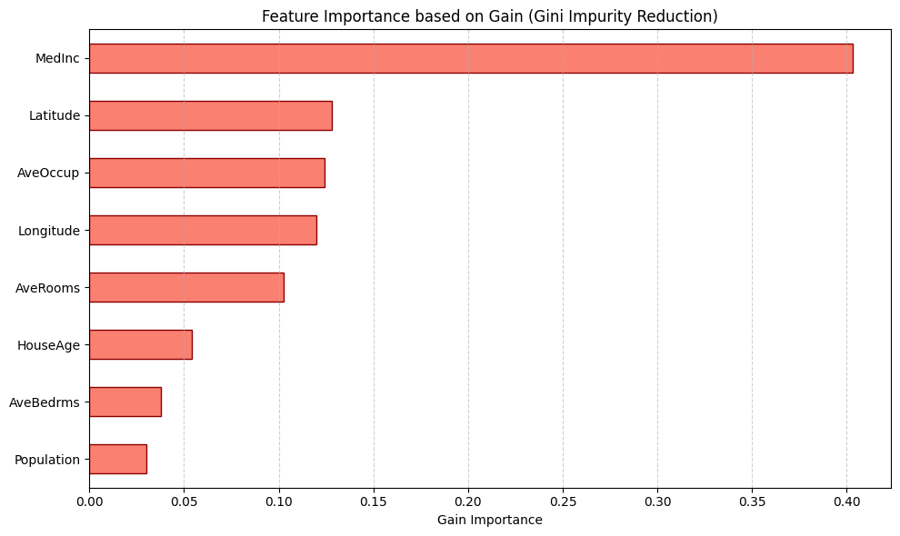
Gain
Gain a feature importance measure that is unique to tree-based models that is calculated as the total reduction of loss or impurity contributed by all splits for a given feature.
Advantages
- Is calculated “for free” with the training of the model
Disadvantages
-
Since it is based on the training data, it is suseptible to overfitting
-
Does not satisfy any of the three properties of consistency, prediction-level explainations or local accuracy
-
It favors continues features over categorical features since there are more opprotunities for splitting. This is also true for high-cardinality categorical features as well that have large numbers of possible splits to choose from
-
Not model agnostic, only works with tree-based methods
1
2
3
4
5
6
7
8
9
10
11
12
13
14
15
16
17
18
19
20
21
# Calculate gain importance from the random forest model
gain_importance = pd.Series(best_rf.feature_importances_, index=X_train.columns).sort_values(ascending=True)

# Create horizontal bar plot for gain importance
plt.figure(figsize=(10, 6))
gain_importance.plot.barh(color='salmon', edgecolor='darkred')

# Add labels and title
plt.xlabel('Gain Importance')
plt.title('Feature Importance based on Gain (Gini Impurity Reduction)')

# Add grid for better readability
plt.grid(axis='x', linestyle='--', alpha=0.6)

# Show the plot
plt.tight_layout()
plt.show()

# Print the actual values
for feature, importance in gain_importance.items():
    print(f"{feature}: {importance:.6f}")
1
2
3
4
5
6
7
8
Population: 0.030192
AveBedrms: 0.037859
HouseAge: 0.054283
AveRooms: 0.102357
Longitude: 0.120074
AveOccup: 0.124234
Latitude: 0.127828
MedInc: 0.403173
Introduction to SHAP Values for Tree-Based Models
SHAP values stand for SHapley Additive Predictions were introduced in 2017 by Lundberg and Lee [1]. They are based on Shapely values from cooperative game theory, which is a theoretically sound way to fairly allocate the payouts to players in a coopoerative game. We won’t take the game theory connections too far here, but you can think of the “game” as the machine learning model being explained, the “players” as the input features to the model, and the “payout” the model predictions. SHAP values calculate the contribution each feature made to the prediction.
Lundberg and Lee showed that SHAP values are the only explainatory model that satisfies the three properties that we discussed earlier.
-
Consistency
-
Local Accuracy / Additivity
-
Prediction-level explainations
Formally, additivity means that if $\phi_i$ is the SHAP value for the $i$ feature, the sum of the SHAP values equals the difference between the model output and the expected output.
\[f(x) - E[f(x)] = \sum_{i=1}^F \phi_i \ \Longrightarrow \ f(x) = E[f(x)] + \sum_{i=1}^F \phi_i\]These properties unlock a variety of rich visualizations and diagnostic plots that we can use in place of the global feature importance measures that we just discussed. They can also be augmented by traditional Partial Dependence Plots and Individual Conditional Expectation plots, both of which we will review later in this presentation.
Some SHAP Theory
Formally, let
\[\phi_i = \sum_{S\subseteq F/\{i\}} \frac{1}{|F|} \frac{1}{\binom{|F|-1}{|S|}} \Big[ E[f(x) | x_{S\cup\{i\}}] - E[f(x) | x_S] \Big]\]where
-
$\vert F \vert$ is the number of features
-
$\vert S\vert$ is the number of features in the subset $S \subset F$
-
$E[f(x) \vert x_{S\cup{i}}]$ is the conditional expectation of the model given the features $x_{S\cup{i}}$
-
$E[f(x) \vert x_S]$ is the conditional expectation of the model given the features $x_S$
$\phi_0 = f_{\empty}(\empty)$
In Words
A one-line definition:
A SHAP value is the average marginal change in the model output from adding a feature to a subset of features, averaged over all such subsets not containing that feature.
More precisely:
To calculate the SHAP value for feature $i$, we consider all possible subsets $S$ of features that exclude feature $i$. For each subset, we compute the marginal contribution of adding feature $i$ to that subset, which is the difference between the expected model output when $S$ and feature $i$ are known versus when only $S$ is known. We then take the weighted average of these contributions across all possible subsets where the weights are related to the number of such subsets.
In steps:
-
Train a machine learning model $f$.
-
For each feature $i$, consider all the subsets that exclude $i$.
-
Compute the expected difference in the expected model outputs $E[f(x) \vert x_{S\cup{i}}] - E[f(x) \vert x_S]$ with and without the feature.
-
Average over all subsets, with weights equal to the probability of selecting that particular subset.
Let’s unpack the last of these.
The Conditional Expectation
What does $E[f(x) \vert x_S]$ mean?
It is the model’s average prediction when you keep the chosen features in $S$ fixed at their values for a particular data point and average over the other features.
In SHAP, we are setting aside the features $i$ and the features in $S$, holding their values constant for a particular data point, then averaging over the remaining features with and with out $i$ and then computing the difference to see the effect of adding $i$ has on the model output.
The Weights
The weights in the sum above are the probability of selecting a particular subset. The term has two parts:
Given a feature $i$, the number of subsets of $S\subseteq F / {i }$ is \(\binom{|F|-1}{|S|}\),
so the probability of selecting a subset, conditional on $i$ (and assuming selection happens uniformly) is
\[\frac{1}{\binom{|F|-1}{|S|}}\]Since there are $\vert F\vert$ features in the model, the probability of selecting one of them uniformly is $\frac{1}{\vert F\vert}$. So the joint probability of selecting feature $i$ and subset $S\subseteq F / {i }$ is therefore
\[\frac{1}{|F|} \frac{1}{\binom{|F|-1}{|S|}}\]1
2
3
4
5
6
7
8
9
10
11
12
13
14
from math import comb
F = len(X.columns)
combinations = {}
for i in range(1, F):
combinations[i] = comb(F, i)
# Create a DataFrame to store the combinations
combinations_df = pd.DataFrame.from_dict(combinations, orient='index', columns=['Combinations'])
combinations_df.reset_index(inplace=True)
total_combinations = combinations_df['Combinations'].sum()
1
2
3
4
5
6
7
8
9
10
11
12
13
14
15
16
17
18
19
20
21
22
23
24
25
26
27
28
29
30
# Plot the number of combinations by subset size
plt.figure(figsize=(10, 6))
plt.bar(combinations_df['index'], combinations_df['Combinations'], color='skyblue', edgecolor='navy')

# Adding a curve to highlight the pattern
plt.plot(combinations_df['index'], combinations_df['Combinations'], 'ro-', linewidth=2)

# Add annotations for each point
for i, row in combinations_df.iterrows():
    plt.annotate(f"{int(row['Combinations'])}",
                 (row['index'], row['Combinations']),
                 textcoords="offset points",
                 xytext=(0,10),
                 ha='center')

# Add labels and title
plt.xlabel('Size of Subset, |S|', fontsize=12)
plt.ylabel('Number of Combinations', fontsize=12)
plt.title(f'Number of Combinations for Subsets of |F| - 1 = 8 Features', fontsize=14)

# Format x-axis
plt.xticks(combinations_df['index'])
plt.grid(axis='y', linestyle='--', alpha=0.7)

# Add a note about the total
plt.figtext(0.5, 0.01, f"Total number of combinations: {total_combinations}",
            ha="center", fontsize=12, bbox={"facecolor":"lightgray", "alpha":0.5, "pad":5})

plt.tight_layout(rect=[0, 0.03, 1, 0.95])
plt.show()
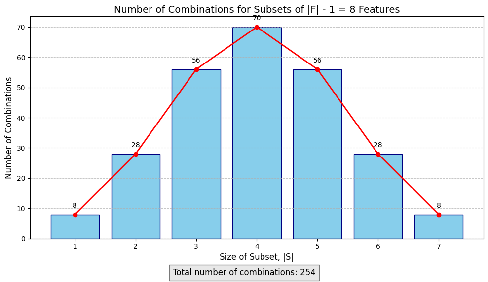
As you can see, the number of possible combinations explodes exponentially with the number of features. The number of subsets in $F/{i}$ is 254, and since there are 9 features, the number of subsets to evaluate is:
1
len(X.columns) * total_combinations
1
2032
That is a lot of subsets! As you can see, the number of subsets explodes exponentially with the number of features.
Computational Difficulties and TreeSHAP
There are two main issues with SHAP values:
-
Estimating the conditional expectations $E[f(x) \mid x_S]$ efficiently
-
The combinatorical complexity of the SHAP value equation
Fortunately, the breakthrough that Lundberg, Erion and Lee made in 2019 [2] discovering a fast algorithm for computing SHAP values for tree-based models. The model is polynomial time, and allows large models with many features on large dataset to be explained quickly using SHAP. The algorithm is called TreeSHAP.
The algorithm is able to compute $E[f(x) \mid x_S]$ and does not require sampling or assuming features are independent.
Visualizations and Applications
1
2
3
4
5
6
7
8
9
from shap import TreeExplainer


X_test_sample = X_test.iloc[:200]


# Initialize the TreeExplainer
explainer = TreeExplainer(model = best_rf, feature_perturbation="tree_path_dependent")
shap_values = explainer(X_test_sample)
We can now verify the local accuracy property and confirm that the sum of the SHAP values equals the prediction.
1
np.allclose(best_rf.predict(X_test_sample), shap_values.values.sum(axis=1) + explainer.expected_value[0])
1
True
1
2
3
4
5
6
7
8
9
10
11
12
13
14
15
16
# set some example points
east_oakland_idx = 5
san_francisco_idx = 0
rancho_cucamonga_idx = 1
visalia_idx = 33
ukaiah_idx = 34

# Mark the sample points with different markers and colors
sample_points = {
    'San Francisco': san_francisco_idx,
    'East Oakland': east_oakland_idx,
    'Rancho Cucamonga': rancho_cucamonga_idx,
    'Visalia': visalia_idx,
    'Ukaiah': ukaiah_idx
}
Single Prediction Plots
Waterfall Plot
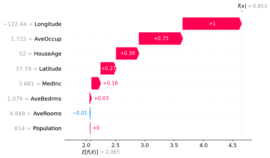
SHAP provides plots that break down individual predictions into feature contributions (the SHAP values). The waterfall plot is a good way to see which features contributed to the prediction, their magnatude and direction. Blue arrows are for features that negatively contribute to the prediction relative to the baseline and the red arrows are for features that positively contribute relative to the baseline value.
Remember that the SHAP values and arrows are relative to the baseline value.
This plot also offers a nice way to visualize the local accuracy property. We can see that the waterfall plot starts at the expected value $E[f(x)]$, which is the predicted value of the model with no features present, and then sum to the predicted value, which is when all features are present.
1
2
sample_idx = san_francisco_idx
shap.plots.waterfall(shap_values[sample_idx])
1
2
3
4
5
6
7
8
9
from utils import map_point

# sanity-check the interpretation of the SHAP plot by looking at where in California the sample is located
map_point(X_test_sample.iloc[sample_idx]['Latitude'], X_test_sample.iloc[sample_idx]['Longitude'],
          y_test[sample_idx], y_pred[sample_idx], X_test_sample.iloc[sample_idx]['MedInc'],
          X_test_sample.iloc[sample_idx]['HouseAge'], X_test_sample.iloc[sample_idx]['AveRooms'],
          X_test_sample.iloc[sample_idx]['AveBedrms'], X_test_sample.iloc[sample_idx]['Population'],
          X_test_sample.iloc[sample_idx]['AveOccup'])
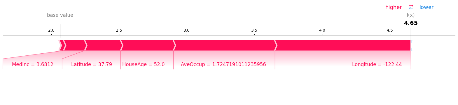
Force Plots
Force plots represent a more compact visualization than the waterfall plot, but shows the same information.
1
2
3
# Create a force plot for the selected sample
shap.plots.force(shap_values[sample_idx], matplotlib=True, show=True)
Global Plots
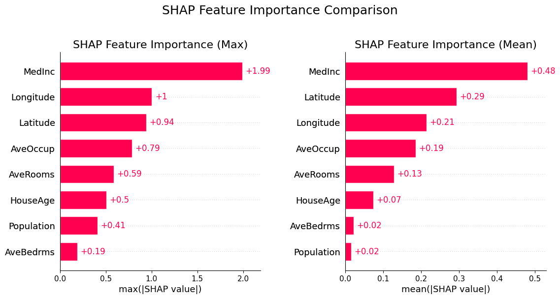
SHAP Summary Plot
SHAP values can be aggregated to create to measure the global feature importance and get a ranking of the most important features, similar to the permutation and gain methods.
-
Left: feature importance ranked by the maximum absolute value of the feature’s SHAP values
-
Right: feature importance ranked to the mean absolute value of the feature’s SHAP values
1
2
3
4
5
6
7
8
9
10
11
12
fig, ax = plt.subplots(1, 2, figsize=(12, 6))

shap.plots.bar(shap_values.abs.max(0), max_display=10, show=False, ax=ax[0], )
ax[0].set_title("SHAP Feature Importance (Max)", fontsize=16)


shap.plots.bar(shap_values.abs.mean(0), max_display=10, show=False, ax=ax[1], )
ax[1].set_title("SHAP Feature Importance (Mean)", fontsize=16)

plt.tight_layout(pad=3)
plt.suptitle("SHAP Feature Importance Comparison", fontsize=18, y=1.05)
plt.show()
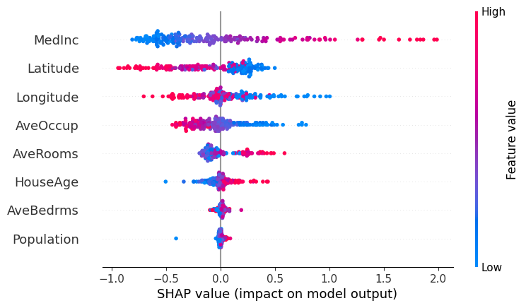
Beeswarm Plot
Beeswarm plots combine information information about the importance, direction and distribution of feature effects.
The features are sorted by the mean absolute value of the SHAP values for the feature and each dot displayed is an individual observation. Each dot’s position on the x-axis is the SHAP value for that data instance’s feature value. Negative values mean that feature had a negative contribution to the predicted output and a positive value means that feature had a positive contribution to the predicted output.
The color of each dot is the value of the feature itself, scaled such that red means “high” and blue means “low”.
This combination of chart aspects allows us to get a sense of
-
The spread of SHAP values.
-
The feature’s overall importance: features with a wider spread and more dots that are far from zero have more global importance and features whose SHAP values cluster near zero have little influence on the model.
-
The correlation between the feature value and its impact via the color pattern:
For example, looking at the MedInc (median income) feature, we can make several observations:
-
Based on the color pattern, lower median incomes tend to have a negative impact on the predicted home price.
- There is wide variation, with many points bunched below zero and a few number of high-income points having a large positive impact on the model.
- This is consistent with a “Pareto” wealth/income distribution, with a few areas of concentrated money with high home prices (this is characteristic of the California economy in general, with places like San Francisco, Beverley Hills, Palo Alto, Carmel etc. having very high incomes and home prices and many poor areas further inland from the coast)
- The plot shows an interesting pattern for the geographic features.
Longtitudeis measured in decimal degrees, and we see that as we move further West (as measured by more negative values for this feature), the feature has a positive effect on the predicted output.- This is consistent with the geography of California, where housing is more expensive the closer to the ocean you get.
1
shap.plots.beeswarm(shap_values, show=True)
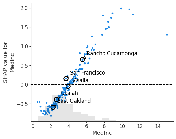
SHAP Dependence Plot
SHAP Dependence Plots are one of the must useful plots that are available to users of SHAP values. They show how the importance of a feature changes with its values. Each point in the scatter plot is an individual observation. The points can be optionally colored by the values of another feature to reveal interactions.
-
Points around the $y = 0$ line are points for which the feature has little impact on the model.
- The plot can reveal trends in feature importance
- monotonic trends indicate the feature has a consistent effect
- otherwise it is indicative of a context-dependent effect, perhaps dependent on other features
- Vertical dispersion of the SHAP values around a feature value indicate interactions with other values, i.e. for a given value of the feature, its effect varies, which must be due to some other factor
In the example below, we look at a simple dependence plot for the MedInc feature. We can see that as median income increases, it has a stronger positive impact on the model output. From where the points cross the $y=0$ line, we can see that having a block that has a median income below 40K starts to have a negative impact on the prediction. Based on the location of the density histogram, median income has a negative effect on the prediction.
1
2
3
4
5
6
7
8
9
10
11
12
13
14
15
16
17
18
19
20
21
22
23
24
25
# Create a SHAP dependence plot for longitude colored by median income
shap_scatter = shap.plots.scatter(shap_values[:, "MedInc"], show=False)

fig = plt.gcf()
ax = plt.gca()

# Add vertical lines and annotations for sample points
for name, idx in sample_points.items():
    # Extract MedInc value and corresponding SHAP value
    medinc = X_test_sample.iloc[idx]['MedInc']
    shap_value = shap_values[idx, "MedInc"].values

    # Mark the point
    ax.plot(medinc, shap_value, 'o', markersize=10,
            markerfacecolor='none', markeredgecolor='black', markeredgewidth=2)

    # Add label
    ax.annotate(name, xy=(medinc, shap_value), xytext=(10, 10),
                textcoords='offset points', fontsize=12,
                arrowprops=dict(arrowstyle='->', connectionstyle='arc3,rad=0.2'))


ax.axhline(0, color='k', linestyle='--')
1
<matplotlib.lines.Line2D at 0x7f02a0f24890>
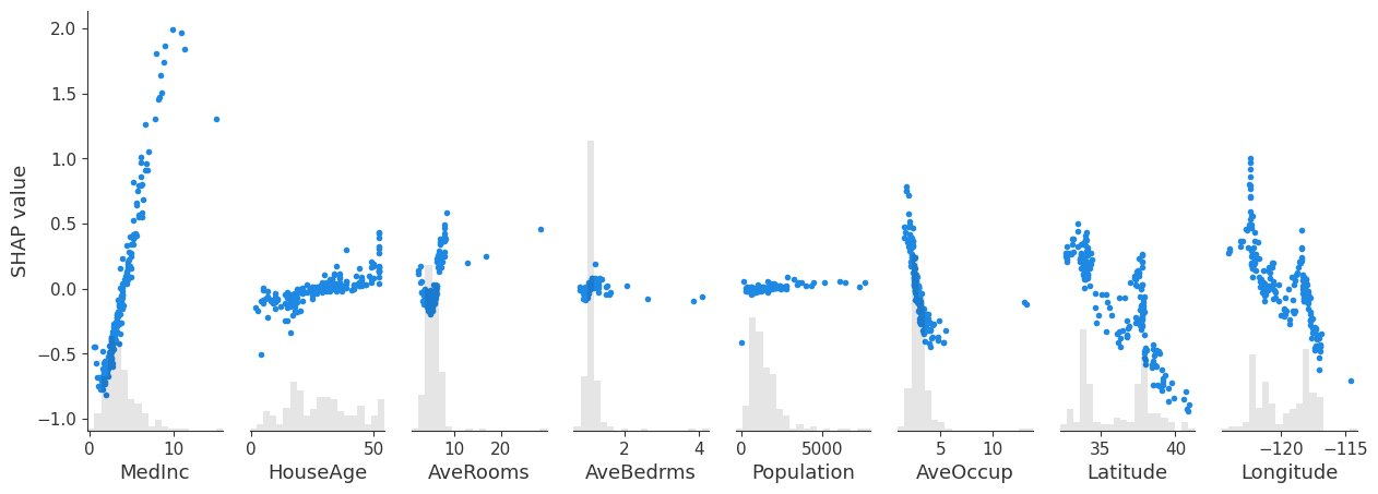
By not specifying the variable, we can get a compact plot with the dependence plots for all features.
1
shap.plots.scatter(shap_values, show=True)
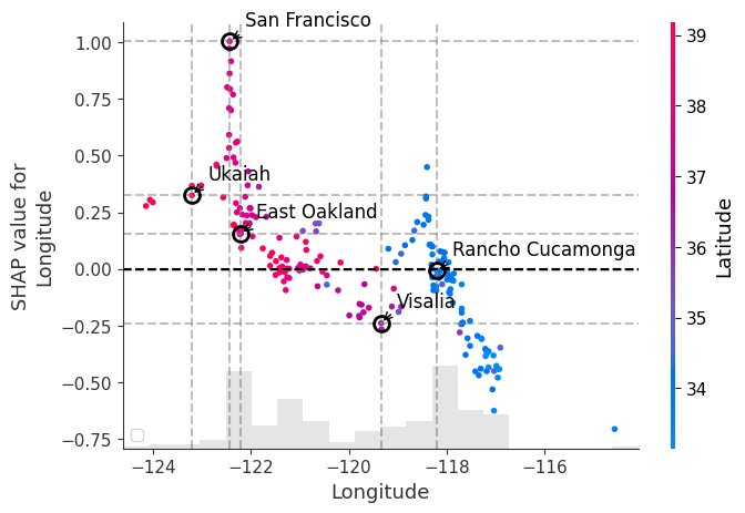
In the example below, we plot the SHAP dependence plot for the Longtitude feature and color by the Latitude feature. We can immediately observe the following:
- There is a trend where points in Western most latitudes and Eastern most latitudes are heavily influenced by their location.
- These represent the coastal areas of the Bay Area and the inland parts of Southern California, respectively, as indicated by the shading where blue is further south and red is further north.
- The vertical dispersion between San Francisco and East Oakland shows that the effect of longtitude in and around the SF Bay Area is heavily influenced by other features.
1
2
3
4
5
6
7
8
9
10
11
12
13
14
15
16
17
18
19
20
21
22
23
24
25
26
27
28
29
30
31
32
33
34
35
36
37
38
39
40
41
42
43
44
45
# Create a SHAP dependence plot for longitude colored by latitude
shap_scatter = shap.plots.scatter(shap_values[:, "Longitude"], color=shap_values[:, "Latitude"], show=False)

# Get the current figure and axes
fig = plt.gcf()
ax = plt.gca()

# Mark the sample points with different markers and colors
sample_points = {
    'San Francisco': san_francisco_idx,
    'East Oakland': east_oakland_idx,
    'Rancho Cucamonga': rancho_cucamonga_idx,
    'Visalia': visalia_idx,
    'Ukaiah': ukaiah_idx
}

# Store SHAP values for the sample points
shap_values_at_locations = {}

# Add vertical and horizontal lines for each sample point
for name, idx in sample_points.items():
    # Extract longitude value and corresponding SHAP value for the sample point
    longitude = X_test_sample.iloc[idx]['Longitude']
    shap_value = shap_values[idx, "Longitude"].values
    shap_values_at_locations[name] = shap_value

    # Plot cross-hairs for each point
    ax.axvline(x=longitude, color='gray', linestyle='--', alpha=0.5)
    ax.axhline(y=shap_value, color='gray', linestyle='--', alpha=0.5)

    # Mark the point with a star
    ax.plot(longitude, shap_value, 'o', markersize=10,
            markerfacecolor='none', markeredgecolor='black', markeredgewidth=2)

    # Add label for the point
    ax.annotate(name, xy=(longitude, shap_value), xytext=(10, 10),
                textcoords='offset points', fontsize=12,
                arrowprops=dict(arrowstyle='->', connectionstyle='arc3,rad=0.2'))

# add zero line
ax.axhline(y=0, color='k', linestyle='--')

ax.legend()
plt.show()
plt.tight_layout()
1
2
/tmp/ipykernel_824/1079194726.py:43: UserWarning: No artists with labels found to put in legend.  Note that artists whose label start with an underscore are ignored when legend() is called with no argument.
  ax.legend()
1
<Figure size 640x480 with 0 Axes>
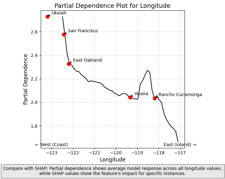
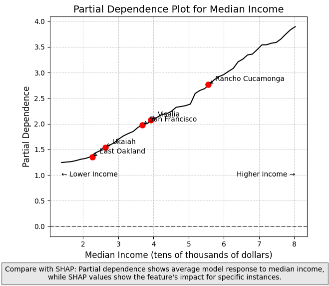
Using with Partial Dependence Plots
Partial Dependence Plots (PDPs) complement SHAP values by showing how the model’s predicted output changes as a function of a single feature, averaging over all other features. While SHAP values show the importance of features for individual predictions, PDPs provide a global view of how a feature affects predictions across the entire dataset.
PDPs illustrate the marginal effect of a feature on the predicted outcome by showing the average effect of the feature on the prediction, marginalized over all other features. What this essentially means is varying the value of a single feature while averaging over the remaining features. (Note on causaulity: the effect is specific to the model, and not necessarily causal in reality).
Differences Between SHAP and PDPs
- SHAP values: Show contribution of a feature to a specific prediction, accounting for feature interactions
- PDPs: Show the average effect of a feature across all predictions, averaging out interactions
When used together, they provide complementary insights:
- PDPs show general trends in how features affect predictions
- SHAP values reveal how these effects vary across individual data points and detect feature interactions
The longitude PDP in the next cell demonstrates this complementary relationship - showing how the average predicted house price changes from west to east across California, while SHAP values reveal how this effect differs for specific locations (the impact is higher in places like the SF Bay Area and inland Southern California).
1
2
3
4
5
6
7
8
9
10
11
12
13
14
15
16
17
18
19
20
21
22
23
24
25
26
27
28
29
30
31
32
33
34
35
36
37
38
39
40
41
42
43
44
45
46
47
48
49
from sklearn.inspection import partial_dependence

# Calculate partial dependence for longitude
pdp_result = partial_dependence(
    best_rf,
    X_test_sample,
    features=['Longitude'],
    kind='average',
    grid_resolution=50
)

# Extract PDP values and grid points
longitude_grid = pdp_result['grid_values'][0]
pdp_values = pdp_result['average'][0]

# Create PDP plot
plt.figure(figsize=(6, 6))
plt.plot(longitude_grid, pdp_values, 'k')
plt.xlabel('Longitude', fontsize=12)
plt.ylabel('Partial Dependence', fontsize=12)
plt.title('Partial Dependence Plot for Longitude', fontsize=14)
plt.grid(True, linestyle='--', alpha=0.6)

# Mark specific locations
for name, idx in sample_points.items():
    longitude = X_test_sample.iloc[idx]['Longitude']
    # Find the closest index in our grid
    closest_idx = np.abs(longitude_grid - longitude).argmin()
    pd_value = pdp_values[closest_idx]

    plt.plot(longitude, pd_value, 'ro', markersize=8)
    plt.annotate(name, (longitude, pd_value),
                 xytext=(10, 5), textcoords='offset points',
                 arrowprops=dict(arrowstyle='->', connectionstyle='arc3,rad=.2'))


plt.annotate('← West (Coast)', xy=(-123, min(pdp_values)), xytext=(0, -10),
             textcoords='offset points', fontsize=10, ha='center')
plt.annotate('East (Inland) →', xy=(-117, min(pdp_values)), xytext=(0, -10),
             textcoords='offset points', fontsize=10, ha='center')

plt.figtext(0.5, 0.01,
            "Compare with SHAP: Partial dependence shows average model response across all longitude values,\n"
            "while SHAP values show the feature's impact for specific instances.",
            ha="center", fontsize=10, bbox={"facecolor":"lightgray", "alpha":0.5, "pad":5})

plt.tight_layout(rect=[0, 0.05, 1, 0.95])
plt.legend()
plt.show()
1
2
/tmp/ipykernel_824/2115221727.py:48: UserWarning: No artists with labels found to put in legend.  Note that artists whose label start with an underscore are ignored when legend() is called with no argument.
  plt.legend()
1
2
3
4
5
6
7
8
9
10
11
12
13
14
15
16
17
18
19
20
21
22
23
24
25
26
27
28
29
30
31
32
33
34
35
36
37
38
39
40
41
42
43
44
45
46
47
48
49
50
51
52
from sklearn.inspection import partial_dependence

# Calculate partial dependence for MedInc
pdp_result = partial_dependence(
    best_rf,
    X_test_sample,
    features=['MedInc'],
    kind='average',
    grid_resolution=50
)


# Extract PDP values and grid points
medinc_grid = pdp_result['grid_values'][0]
pdp_values = pdp_result['average'][0]

# Create PDP plot
plt.figure(figsize=(6, 6))
plt.plot(medinc_grid, pdp_values, 'k')
plt.xlabel('Median Income (tens of thousands of dollars)', fontsize=12)
plt.ylabel('Partial Dependence', fontsize=12)
plt.title('Partial Dependence Plot for Median Income', fontsize=14)
plt.grid(True, linestyle='--', alpha=0.6)

# Mark specific locations
for name, idx in sample_points.items():
    medinc = X_test_sample.iloc[idx]['MedInc']
    # Find the closest index in our grid
    closest_idx = np.abs(medinc_grid - medinc).argmin()
    pd_value = pdp_values[closest_idx]

    plt.plot(medinc, pd_value, 'ro', markersize=8)
    plt.annotate(name, (medinc, pd_value),
                 xytext=(10, 5), textcoords='offset points',
                 arrowprops=dict(arrowstyle='->', connectionstyle='arc3,rad=.2'))

# Add zero line
plt.axhline(y=0, color='k', linestyle='--', alpha=0.5)

# Add annotations for income interpretation
plt.annotate('← Lower Income', xy=(min(medinc_grid), min(pdp_values)), xytext=(0, -20),
             textcoords='offset points', fontsize=10, ha='left')
plt.annotate('Higher Income →', xy=(max(medinc_grid), min(pdp_values)), xytext=(0, -20),
             textcoords='offset points', fontsize=10, ha='right')

plt.figtext(0.5, 0.01,
            "Compare with SHAP: Partial dependence shows average model response to median income,\n"
            "while SHAP values show the feature's impact for specific instances.",
            ha="center", fontsize=10, bbox={"facecolor":"lightgray", "alpha":0.5, "pad":5})

plt.tight_layout(rect=[0, 0.05, 1, 0.95])
plt.show()
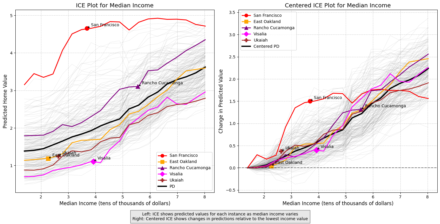
Individual Conditional Expectation (ICE) Plots
Individual Conditional Expectation (ICE) plots extend Partial Dependence Plots (PDPs) by showing the relationship between a feature and the prediction for individual instances rather than just the average effect.
How ICE Plots Relate to PDPs:
- PDP: Shows the average effect of a feature on predictions across all instances
- ICE: Shows the effect for each individual instance as a separate line (the PDP is the average of the curves on the ICE plot)
ICE plots provide several advantages:
-
Revealing Heterogeneous Effects: They can uncover when a feature affects different instances in different ways
-
Detecting Interactions: When ICE lines vary widely in shape, it suggests interactions with other features
-
Identifying Subgroups: Clusters of similar ICE lines can reveal subgroups in the data
For a given sample instance and a given feature, the ICE plot will fix the values of all other features then allow the feature of instance to vary across its range, tracing out how prediction changes while holding all other feature values fixed.
Centered ICE Plots
Centered ICE plots anchor all lines at a common reference point (usually the minimum feature value), making it easier to compare the relative changes across instances. This helps identify:
-
Which instances are most affected by changes in the feature.
-
Where in the feature range the most significant changes occur.
ICE plots complement SHAP by showing not just feature importance, but how the model’s response to a feature varies across the entire input range for each instance.
In the example below, we show the ICE plots for the MedInc feature. We see that the partial dependence plot obscured San Francisco’s above average predicted home value and that San Francisco exhibits unusual behavior when compared to other locations, with the predicted model output actually decreasing as medican income decreases further. This could reflect an initial location premium for San Francisco, but eventually as incomes increase beyond a certain point, larger houses become more desirable and affordable compared to San Francisco’s dense and mostly apartment-based housing stock.
1
2
3
4
5
6
7
8
9
10
11
12
13
14
15
16
17
18
19
20
21
22
23
24
25
26
27
28
29
30
31
32
33
34
35
36
37
38
39
40
41
42
43
44
45
46
47
48
49
50
51
52
53
54
55
56
57
58
59
60
61
62
63
64
65
66
67
68
69
70
71
72
73
74
75
76
77
78
79
80
81
82
83
84
85
86
87
88
89
90
91
92
93
94
95
96
97
98
99
100
101
102
103
104
# Calculate ICE for MedInc
ice_result = partial_dependence(
    best_rf,
    X_test_sample,
    features=['MedInc'],
    kind='individual',
    grid_resolution=20
)

# Extract values
medinc_grid = ice_result['grid_values'][0]
ice_values = ice_result['individual'][0]

# Create centered ICE values
centered_ice = ice_values - ice_values[:, 0].reshape(-1, 1)
centered_pd = centered_ice.mean(axis=0)

# Create figure with two subplots
fig, (ax1, ax2) = plt.subplots(1, 2, figsize=(15, 8))

# Plot ICE lines with low opacity
for i in range(len(ice_values)):
    ax1.plot(medinc_grid, ice_values[i], color='gray', alpha=0.25, linewidth=0.5)
    ax2.plot(medinc_grid, centered_ice[i], color='gray', alpha=0.25, linewidth=0.5)

# Plot the mean lines
ax1.plot(medinc_grid, ice_values.mean(axis=0), 'k', linewidth=3, label='PD')
ax2.plot(medinc_grid, centered_pd, 'k', linewidth=3, label='Centered PD')

# Mark specific locations on both plots
colors = ['red', 'orange', 'purple', 'magenta', 'brown']
markers = ['o', 's', '^', 'D', 'P']

for idx, (name, loc_idx) in enumerate(sample_points.items()):
    # Get values
    ice_val = ice_values[loc_idx]
    centered_ice_val = centered_ice[loc_idx]

    # Plot lines
    ax1.plot(medinc_grid, ice_val, color=colors[idx % len(colors)], linewidth=2)
    ax2.plot(medinc_grid, centered_ice_val, color=colors[idx % len(colors)], linewidth=2)

    # Mark actual median income value on the curves
    medinc = X_test_sample.iloc[loc_idx]['MedInc']
    closest_idx = np.abs(medinc_grid - medinc).argmin()

    ax1.plot(medinc, ice_val[closest_idx], markers[idx % len(markers)],
             markersize=10, color=colors[idx % len(colors)])
    ax2.plot(medinc, centered_ice_val[closest_idx], markers[idx % len(markers)],
             markersize=10, color=colors[idx % len(colors)])

    # Add labels
    ax1.annotate(name, (medinc, ice_val[closest_idx]),
                 xytext=(10, 5), textcoords='offset points',
                 arrowprops=dict(arrowstyle='->', connectionstyle='arc3,rad=.2'))
    ax2.annotate(name, (medinc, centered_ice_val[closest_idx]),
                 xytext=(10, 5), textcoords='offset points',
                 arrowprops=dict(arrowstyle='->', connectionstyle='arc3,rad=.2'))

# Set titles and labels
ax1.set_title('ICE Plot for Median Income', fontsize=14)
ax1.set_xlabel('Median Income (tens of thousands of dollars)', fontsize=12)
ax1.set_ylabel('Predicted Home Value', fontsize=12)
ax1.grid(True, linestyle='--', alpha=0.6)

ax2.set_title('Centered ICE Plot for Median Income', fontsize=14)
ax2.set_xlabel('Median Income (tens of thousands of dollars)', fontsize=12)
ax2.set_ylabel('Change in Predicted Value', fontsize=12)
ax2.grid(True, linestyle='--', alpha=0.6)
ax2.axhline(y=0, color='k', linestyle='--', alpha=0.5)

# Add legends
handles0 = []
labels0 = []
for idx, name in enumerate(sample_points.keys()):
    handle, = ax1.plot([], [], color=colors[idx % len(colors)], marker=markers[idx % len(markers)],
                     markersize=8, linewidth=2, label=name)
    handles0.append(handle)
    labels0.append(name)
handle_pd, = ax1.plot([], [], 'k', linewidth=3, label='PD')
handles0.append(handle_pd)
labels0.append('PD')
ax1.legend(handles0, labels0, loc='best')

handles1 = []
labels1 = []
for idx, name in enumerate(sample_points.keys()):
    handle, = ax2.plot([], [], color=colors[idx % len(colors)], marker=markers[idx % len(markers)],
                     markersize=8, linewidth=2, label=name)
    handles1.append(handle)
    labels1.append(name)
handle_pd, = ax2.plot([], [], 'k', linewidth=3, label='Centered PD')
handles1.append(handle_pd)
labels1.append('Centered PD')
ax2.legend(handles1, labels1, loc='best')

# Add explanatory text
plt.figtext(0.5, 0.01,
            "Left: ICE shows predicted values for each instance as median income varies\n"
            "Right: Centered ICE shows changes in predictions relative to the lowest income value",
            ha="center", fontsize=10, bbox={"facecolor":"lightgray", "alpha":0.5, "pad":5})

plt.tight_layout(rect=[0, 0.05, 1, 0.95])
plt.show()
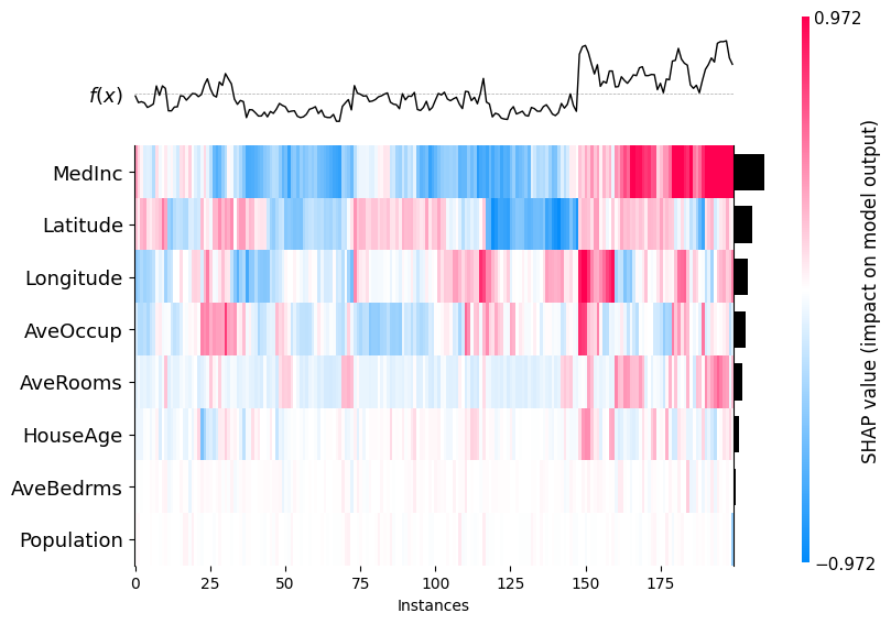
An application of SHAP values is their use in clustering. Here are some facts about the use of SHAP values for clustering.
-
In regression models, the unit of measure of a SHAP value is the same unit as the target variable, so all SHAP values for all features are measured in the same units.
-
Clustering using SHAP values also has an interesting interpretation - data in the same cluster had similar feature importances, which is a different interpretation that in regular clustering, which usually groups points based on spatial proximity.
-
SHAP values with wide dispersion will tend to dominate the clustering, so if you don’t want this, you can still standardize the SHAP values first.
1
shap.plots.heatmap(shap_values)
1
<Axes: xlabel='Instances'>
Additional Information
A Note on Causality
SHAP tells us which inputs the model relies on, not which levers change the real-world outcome. Large SHAP values reflect correlations the model learned; intervening on those features may not shift the target because of confounding, feedback, or distribution shift. Causal claims need extra causal assumptions or other tools, not SHAP alone.
Using SHAP with Time Series Data
SHAP values can produce counter-intuitive results when used with time series data. To see why, consider a set features that is index by time: \(x = [x_{4}, x_{3}, x_{2}, x_1]\)
SHAP considers all subsets of features $S$ to be equally plausible. This means that a time series model may be evaluated with future values visible but values in the past hidden. Consider the following subset:
\[S = \{x_{3}, x_{1}\}\]The problem is that if we know a value further in time, in this case $x_{3}$, then we must necessarily know $x_{2}$ also since you have seen $x_1$. But SHAP weighting does not respect the time ordering of the features.
To solve this problem, Frye, Rowat and Feige [3] created Asymmetric Shapely Values that respect the time ordering by only considering subsets where temporal ordering is preserved.
References
-
Lundberg, S. M., & Lee, S.-I. (2017). A Unified Approach to Interpreting Model Predictions. In Proceedings of the 31st International Conference on Neural Information Processing Systems (NIPS 2017). https://arxiv.org/abs/1705.07874
-
Lundberg, S. M., Erion, G. G., & Lee, S.-I. (2019). Consistent Individualized Feature Attribution for Tree Ensembles. arXiv preprint arXiv:1802.03888. https://arxiv.org/abs/1802.03888
-
Frye, C., Rowat, C., & Feige, I. (2020). Asymmetric Shapley Values: Incorporating Causal Knowledge into Model-Agnostic Explainability. In Advances in Neural Information Processing Systems (NeurIPS 2020). https://arxiv.org/abs/1910.06358
-
SHAP Documentation: https://shap.readthedocs.io
-
Molnar, Christoph. Interpretable Machine Learning: A Guide for Making Black Box Models Explainable. 3rd ed., 2025. ISBN: 978-3-911578-03-5. Available at: https://christophm.github.io/interpretable-ml-book